DOCS
/ / User Guide

Quick Links 2

Quick Links - links 02


Overview🔗

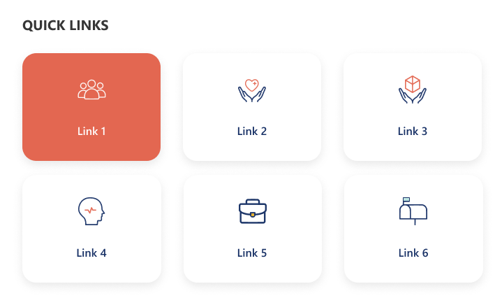
A minimal grid-style quick links design showcasing key resources with large icon buttons. The selected link is highlighted with a color accent for visual focus. It provides a clean and compact view ideal for quick navigation and content discovery.
Overview
Overview

Configuration🔗

Header settings

📸 Header Settings
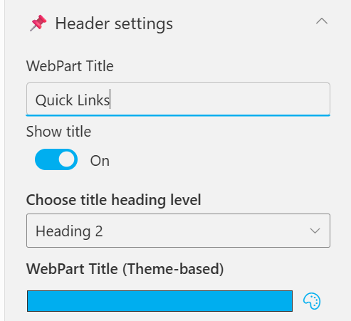
Header Settings
Header Settings
NamePurposeExample / Options
WebPart TitleSpecify a title for the Quick Links Web Part.“Quick Links”
Choose title heading levelSelect the heading level (H1–H6) for the WebPart title.Heading 3
Hide WebPart TitleToggle to show or hide the WebPart title.Show / Hide
WebPart Title (Theme-based)Set a theme-based title color or style for the WebPart.Color Picker

General settings

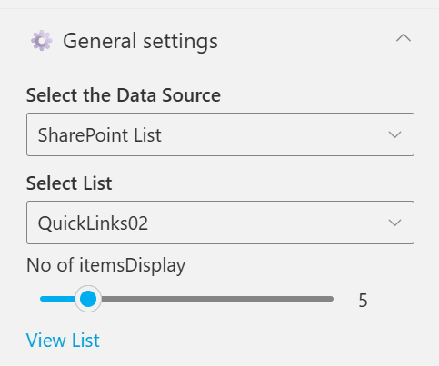
📸 General Settings
General Settings
General Settings
NamePurposeExample / Options
Select the Data SourceChoose the data source type for fetching list items. [Sharepoint List, Collection Data, Data Collect from Panel]SharePoint List
Select ListChoose which SharePoint list to display data fromQuickLinks02
No of itemsDisplayControl how many items should be displayed in the section.Slider (e.g., 6)
View ListOpen the SharePoint list directly in a new tab.Link (View List)

Appearance settings

📸 Appearance Settings
Appearance Settings
Appearance Settings
NamePurposeExample / Options
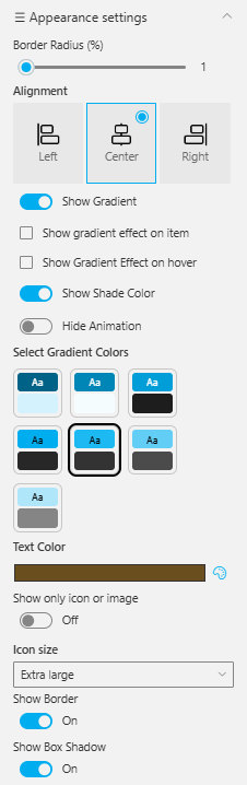
Border Radius (%)Adjusts the roundness of corners for items.Slider (1%)
AlignmentSets the alignment of content.Left / Center / Right
Show GradientEnables gradient background for items.On / Off
Show Gradient Effect on ItemApplies gradient only to selected items.Checkbox
Show Gradient Effect on HoverDisplays gradient when hovering over items.Checkbox
Show Shade ColorAdds a shading overlay for depth.On / Off
Hide AnimationDisables animations for a static appearance.Toggle
Select Gradient ColorsChoose color pairs for gradient effects.Multiple preset swatches
Text ColorSets the color of text elements.Color Picker (Brown)
Show Only Icon or ImageDisplays only icons or images without text.On / Off
Icon SizeAdjusts icon size within the web part.Extra large
Show BorderToggles border visibility around elements.On / Off
Show Box ShadowAdds or removes a shadow behind boxes or items.On / Off

🆘 Support🔗

For help or inquiries, contact SharePoint Designs: 🌐 www.sharepointdesigns.com 📧 support@sharepointdesigns.com