DOCS
/ / User Guide

Quick Links 1

Quick Links - link 01


Overview🔗

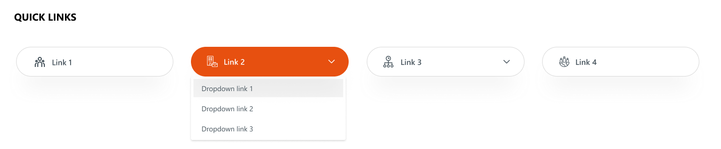
An enhanced quick links layout where certain links include dropdowns for sub-links. It combines clean icons, rounded button styling, and contextual navigation options. This format supports hierarchical navigation, making it suitable for displaying grouped or related quick links.
Overview
Overview

Configuration🔗

Header settings

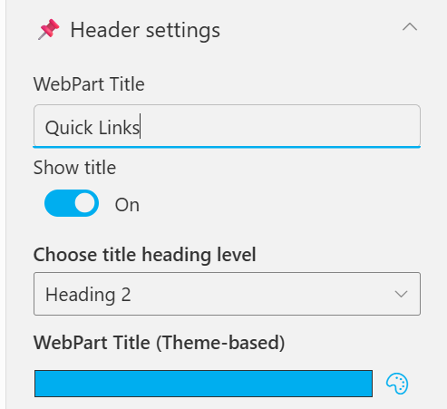
📸 Header Settings
Header Settings
Header Settings
NamePurposeExample / Options
WebPart TitleSpecify a title for the Quick Links Web Part.“Quick Links”
Choose title heading levelSelect the heading level (H1–H6) for the WebPart title.Heading 3
Hide WebPart TitleToggle to show or hide the WebPart title.Show / Hide
WebPart Title (Theme-based)Set a theme-based title color or style for the WebPart.Color Picker

General settings

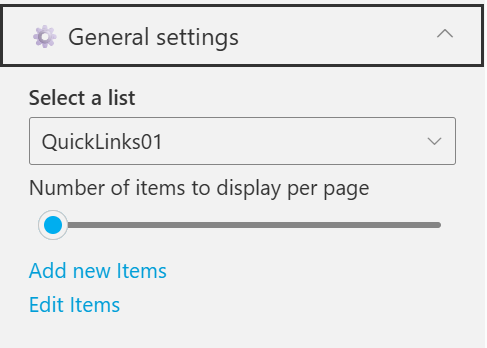
📸 General Settings
General Settings
General Settings
NamePurposeExample / Options
Select ListChoose which SharePoint list to display data from.QuickLinks
Number of items to display per pageDefine the maximum number of quick links to display per page.Slider (e.g., 3)
Add New ItemsShortcut to add new list items directly.Link (Add New Items)
Edit ItemsOpens the selected list to modify existing entriesLink (Edit Items)

Appearance settings

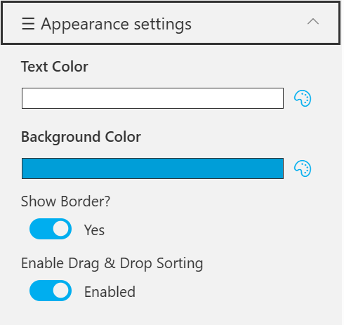
📸 Appearance Settings
Appearance Settings
Appearance Settings
NamePurposeExample / Options
Text ColorSet the text color for items or labels in the web part.Color Picker(White)
Background ColorChoose a background color for the section or item area.Color Picker (Blue)
Show BannerDisplay a banner background behind the title.Checkbox
Show Border?Toggle the border visibility for the displayed items.Yes / No
Enable Drag & Drop SortingAllow users to reorder items within the web part easily.Enabled / Disabled

🆘 Support🔗

For help or inquiries, contact SharePoint Designs: 🌐 www.sharepointdesigns.com 📧 support@sharepointdesigns.com