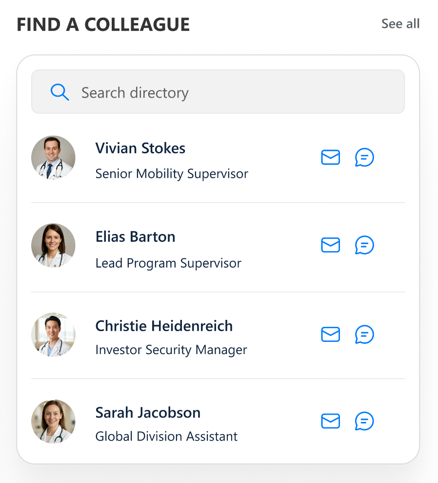
Configuration — Healthcare Intranet Design 2 — Modern SharePoint for Healthcare.
Note:
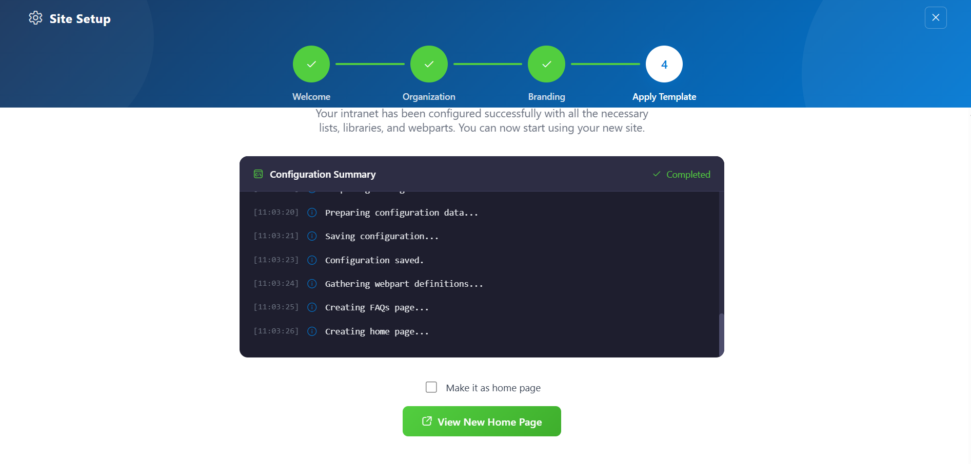
The Home page should be configured using the "Healthcare Intranet Design 2 — Modern SharePoint for Healthcare Setup" web part to ensure that the required lists and libraries are created automatically. Without this configuration, users will need to manually create dedicated lists or libraries for the respective web parts.
1. Set Up Wizard🔗
1Since this is a first-time setup (or setup was not previously completed), a full-page Setup Wizard will automatically appear — no need to manually add any web part.
2Walk through the wizard steps: Organizational Details — Enter your organization information. Branding — Upload your site logo. The wizard uses AI to automatically generate a brand color palette from the logo. You can review, adjust, or change the suggested colors before clicking Save and Apply Theme. You can also upload a custom favicon and configure regional settings. Deploy & Template* — Deploy the intranet layout. Once deployed, the page is saved as a template so it can be reused later to recreate the site layout.
3Do not close the browser during deployment. The wizard will create the required lists, libraries, and layout with sample data.
4Once deployment is complete, you will be given the option to set the newly created page as your homepage. Click View Page to open the new page with the full healthcare 2 layout applied.
📸 Screenshot
🟦 2. Welcome Banner🔗
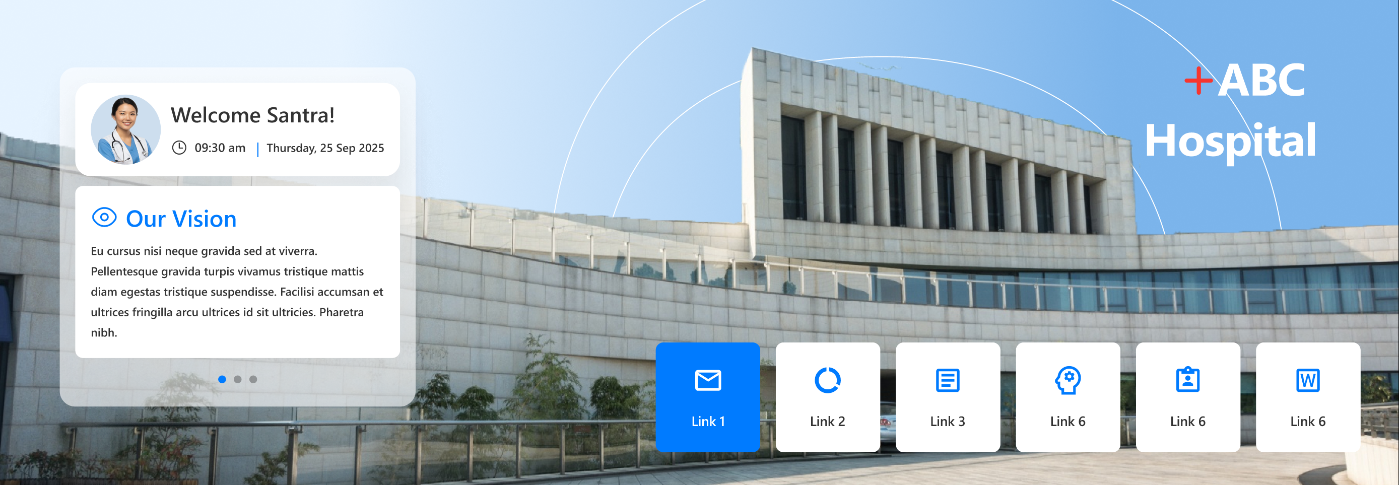
A customizable home section with flexible greeting, announcements, and quick links for every user. Move, resize, and theme components easily.
📸 Welcome Banner
Welcome Banner
🛠️ General Settings
Name
Description
Example/Options
Welcome Message
Main greeting, can use tokens
"Good Morning"
Show Header
Show/hide webpart title
Yes / No
Heading Level
h2, h3, custom px
h2
Custom Font Size
Font size if custom heading
30
Show User Card
Show/hide user info panel
Yes / No
Show Announcements
Enable announcement tile
Yes / No
Show Quick Links
Enable quick links tile
Yes / No
🖼️ Background & Positioning
Name
Description
Example/Options
Background Image
Upload/choose banner background
Image Picker
Enable Dragging
Allow moving of banner components
On / Off
Reset Layout
Snap all elements back to default
Button
🔗 Quick Links Configuration
Name
Description
Example/Options
Data Source
Where quick links are managed
Panel / List
Border Radius (%)
How rounded link tiles are
7
Alignment
Arrange horizontal alignment
Center / Left / Right
Icon Size
Select tile icon size
Dropdown
Text Color
Quick link text color
Color Picker
Items to Display
Max links shown
6
🎨 Appearance
Name
Description
Example/Options
Theme Colors
Select global banner theme
Color Picker
Show Box Shadow
Enable shadow for quick links
On / Off
Hide Animation
Remove click/hover motion
On / Off
ℹ️ About
Name
Description
Example/Options
Developer Info
Credits & support
SharePoint Designs
Documentation Link
Official user/admin docs
[Link]
Activate License
Enable premium features
Button
🟦 3. Announcement🔗
Display rotating banners for important updates—using icons, links, colors, and expiry.
📸 Announcement Bar
Announcement Bar
🛠️ General Settings
Name
Description
Example/Options
Header Title
Main bar heading
[Text field]
Announcement Icon
Featured icon
Icon Picker
🗄️ Announcement Items
Name
Description
Example/Options
Add/Edit Items
Create collection of announcements
Collection List
Title/Link/Expiry
Each item has link + end date
Fill-in fields
🎨 Appearance Settings
Name
Description
Example/Options
Accent Color Theme
Banner color set
Theme dropdown
Hide If Empty
Remove part if no items
Yes / No
🚦 Carousel/Functionality
Name
Description
Example/Options
Enable Auto Play
Auto-rotate cards
Yes / No
Auto Play Speed
Seconds per rotation
1–20
Enable Infinite Loop
Repeat carousel in loop
Yes / No
Show Arrows
Show next/previous arrows
Yes / No
ℹ️ About
Name
Description
Example/Options
Developer Info
Credits & support
SharePoint Designs
Documentation Link
Access official guides
[Link]
Activate License
Enable premium features
Button
🟦 4. Document Content🔗
Display documents from a SharePoint library, enabling sorting, notification badges, and external launch.
📸 Document Content
Document Content
🛠️ General Settings
Name
Description
Example/Options
Webpart Title
Section name
Document Content
Show Webpart Title
Show/hide title
Yes / No
Heading Level
h2/h3/h4/custom px
h3
Custom Font Size
Title size (if custom)
12–72 px
Select Library
Target SP library
Library Picker
Goto Library
Open list in new tab
Yes / No
🗄️ Content/Display
Name
Description
Example/Options
Enable Notification Badge
Highlight new/changed docs
On / Off
Highlight by
Show by created/modified
Uploaded/Modified
Show changes from
Recent doc window
7, 30, 365 days
Choose layout
Select grid/card style
Document Content
Show folder title
Folder name display
Yes / No
Folders per row
Density of grid
1–12
Show Navigation
Pagination between pages
On / Off
🎨 Appearance
Name
Description
Options
Enable borders
Card edge display
Yes / No
Enable shadow
Card shadow effect
Yes / No
Open files in new tab
Link opens away from page
New tab / Same tab
🛠️ Admin/Permissions
Name
Description
Options
Show Admin
Extra features for admins
Yes / No
Admins
Choose admin persons
People Picker
ℹ️ About
Name
Description
Example/Options
Developer Info
Credits & support
SharePoint Designs
Documentation Link
Access official guides
[Link]
Activate License
Enable premium features
Button
🟦 5. Employee Spotlight🔗
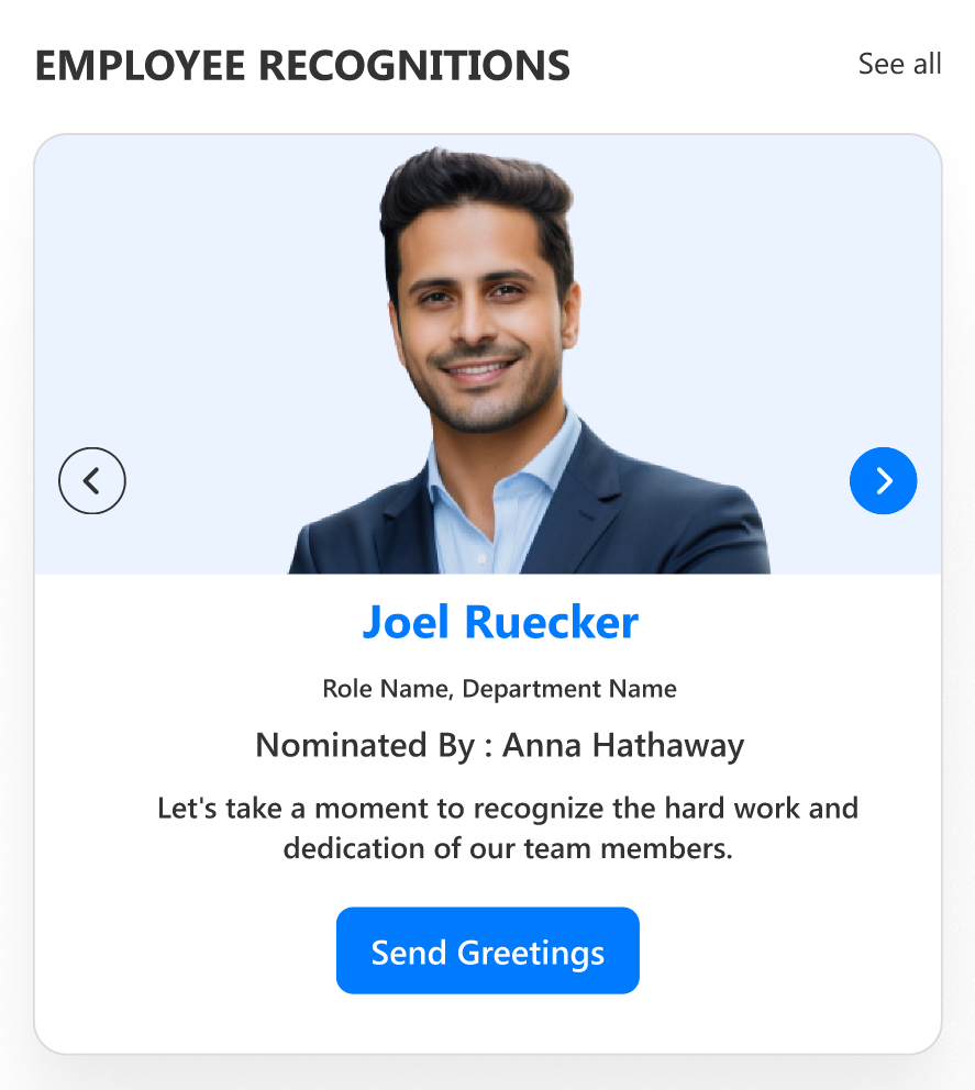
Highlight employee birthdays, anniversaries, and new joiners in a dynamic, branded carousel. Fine-tune its appearance, layout, and data connections with the grouped settings below.
📸 Employee Spotlight
Employee Spotlight
🛠️ General Settings
Name
Description
Example/Options
Web Part Title
Section heading text
Employee Spotlight
Show Header
Toggle header visibility
Yes / No
Heading Level
Title HTML heading (h1–h6 or custom px)
h3, custom
Custom Font Size
Font size (if heading is custom)
18
Select List
Choose target SharePoint list
List picker
Show Admin Menu
Restrict advanced controls to selected admins
Yes / No
Admins
Person(s) who can admin web part
People Picker
🗄️ Data & Filtering
Name
Description
Example/Options
Filter Period
Restrict by date/time
Today, This Month, Last Week
Show Category Filter
Enable buttons for Birthday, Anniversary etc.
Yes / No
Filter by Category
Select visible event types
All, Birthday, Anniversary
Category Filter Alignment
Align filter buttons
Left / Center / Right
🎨 Appearance Settings
Name
Description
Example/Options
Color Mode
Theme/Manual/Branding customisation
Dropdown
Custom Colors
Title, element & category colors
Theme picker/color chooser
Show Border
Enable/disable card border
Yes / No
Show Shadow
Card shadow
Yes / No
Border Radius
Roundness of cards
8–25 px
Enable Background Image 1
Show background behind carousel
Yes / No, Image Picker
Background Image 1
Upload or select background
Image Picker
Enable Top Flag Image
Show decorative “flag” image above carousel
Yes / No, Image Picker
Top Flag Image
Select flag image
Image Picker
🚦 Carousel/Functionality
Name
Description
Example/Options
Carousel Auto-Play
Automatic rotation
Enable / Disable
Auto Play Speed
Seconds per transition
1–60
Show Navigation Arrows
Show/hide left–right controls
Yes / No
ℹ️ About
Name
Description
Example/Options
Developer Info
Credits & support
SharePoint Designs
Documentation Link
Access official guides
[Link]
Activate License
Enable premium features
Button
🟦 6. Take a Breath🔗
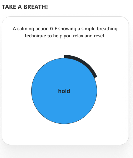
Breathing exercise block with animation and admin-editable commentary—remind users to pause and reset.
📸 Take a Breath
Take a Breath
🛠️ General Settings
Name
Description
Example/Options
Webpart Title
Title above the animation
Take a Breath
Show Header
Toggle header
Yes / No
Heading Level
h2/h3/custom px
h2, custom
Custom Font Size
Font size if custom selected
24
Select Library
List or library for the commentary
Library Picker
Goto Library
Quick access to edit source
Yes / No
📋 Content & Carousel
Name
Description
Example/Options
Descriptions
Add/manage calming instructions
Inline Collection
Carousel Settings
Control slides/auto-play/infinity
Sliders/Toggles
🎨 Appearance
Name
Description
Example/Options
Show Border
Card border
Yes / No
Show Shadow
Drop shadow
Yes / No
Theme Color
Branding accent for this block
Color Picker
ℹ️ About
Name
Description
Example/Options
Developer Info
Credits & support
SharePoint Designs
Documentation Link
Official user/admin docs
[Link]
Activate License
Enable premium features
Button
🟦 7. Organization Chart🔗
Visualize your company's hierarchical structure with advanced filtering and layout controls.
📸 Organization Chart
Organization Chart
🛠️ General Settings
Name
Description
Example/Options
Webpart Title
Section header text
Organization Chart
Show Header
Toggle visibility of header
Yes / No
Heading Level
Title HTML heading (h1–h6 / custom px)
h3, custom
Custom Font Size
Font size if heading is custom
24
🗄️ Data & Filtering
Name
Description
Example/Options
Filter Field
Choose field for filtering (e.g. department, role)
Dropdown
Enable Category Filter
Show filter controls for org structure
Yes / No
🎨 Appearance Settings
Name
Description
Example/Options
Show Border
Enable card border
Yes / No
Show Shadow
Add card shadow
Yes / No
Height
Chart vertical size (px)
320 px
Node Color
Set node color
Color Picker
Accent Color
Accent node/line color
Color Picker
🚦 Layout & Functionality
Name
Description
Example/Options
Card Layout
Select between possible layouts
Layout 1
Card Height/Width
Card sizing
px fields (flexible)
ℹ️ About
Name
Description
Example/Options
Developer Info
Credits & support
SharePoint Designs
Documentation Link
Official user/admin docs
[Link]
Activate License
Enable premium features
Button
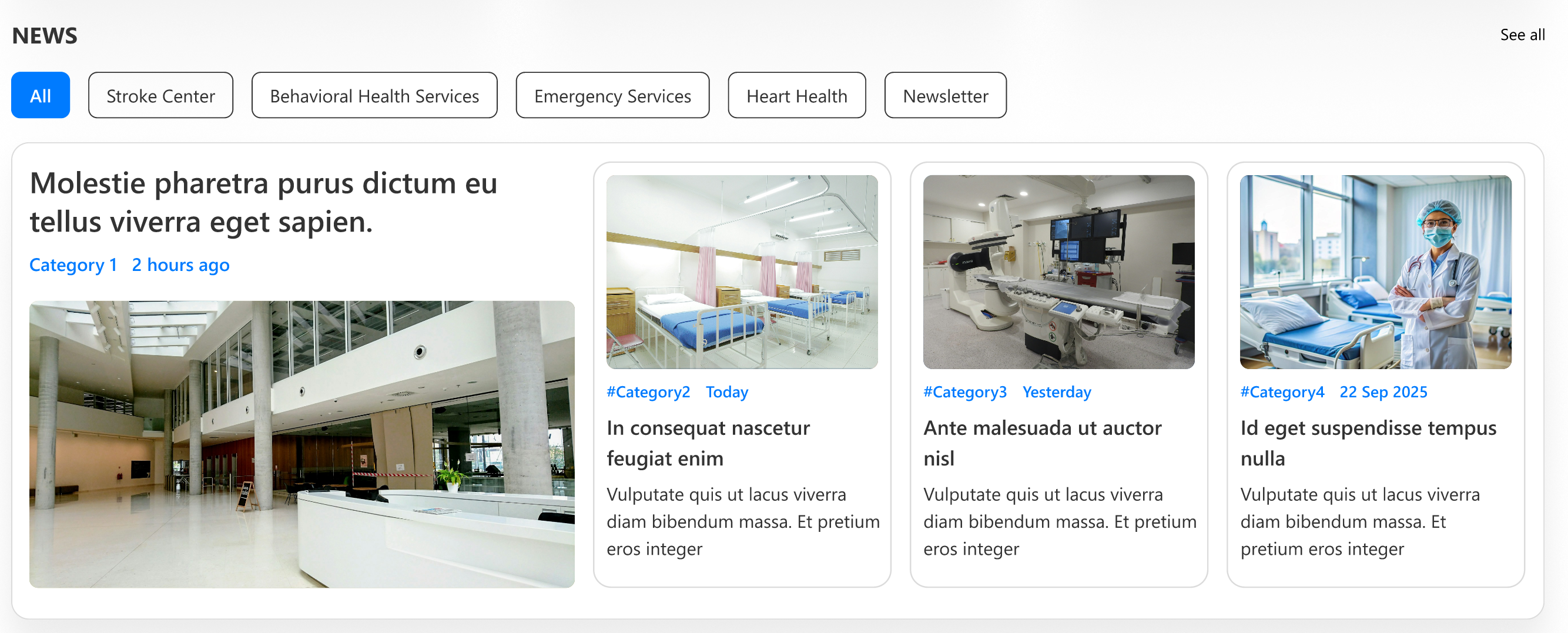
🟦 8. News🔗
Aggregate updates from sites, filtered by audience and category, with tailored layout and appearance.
📸 News
News
🛠️ General Settings
Name
Description
Example/Options
Webpart Title
Title for news rollup
News
Show Header
Show/hide top header
Yes / No
Heading Level
h1–h6/custom px
h3, custom
Custom Font Size
Custom height for header
px
Show See All Button
Quick link to news archive
Yes / No
See All Link
URL to full news
URL
🗄️ Content, Data & Filtering
Name
Description
Example/Options
Search Sites
Which SharePoint sites to aggregate
Site Picker
Target Audience
User/groups to restrict readers
People Picker
News Category
Managed term for filtering
Dropdown
Apply Filters
Further filtering
Multi-select
Items to Show
How many updates are visible
Numeric
🎨 Appearance & Layout
Name
Description
Example/Options
Show Border
Border styling
Yes / No
Show Shadow
Add a drop shadow
Yes / No
Layout
Layout/arrangement of news
News2/Other
Open in New Tab
Links open externally
Yes / No
ℹ️ About
Name
Description
Example/Options
Developer Info
Credits & support
SharePoint Designs
Documentation Link
Official user/admin docs
[Link]
Activate License
Enable premium features
Button
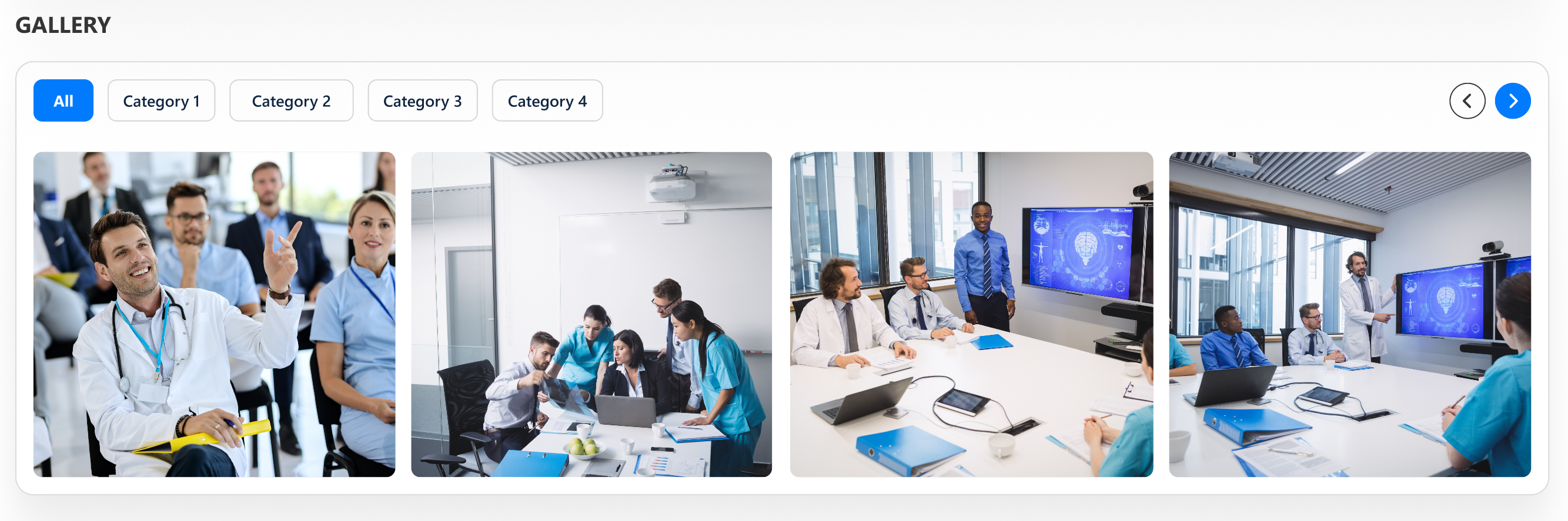
🟦 9. Gallery🔗
Showcase image libraries with upload/button/appearance controls and full layout flexibility.